Week 1️⃣ 6️⃣
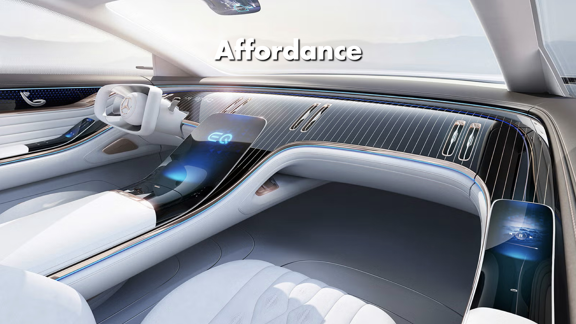
Affordance
🔊 Audio
📜 Show transcript
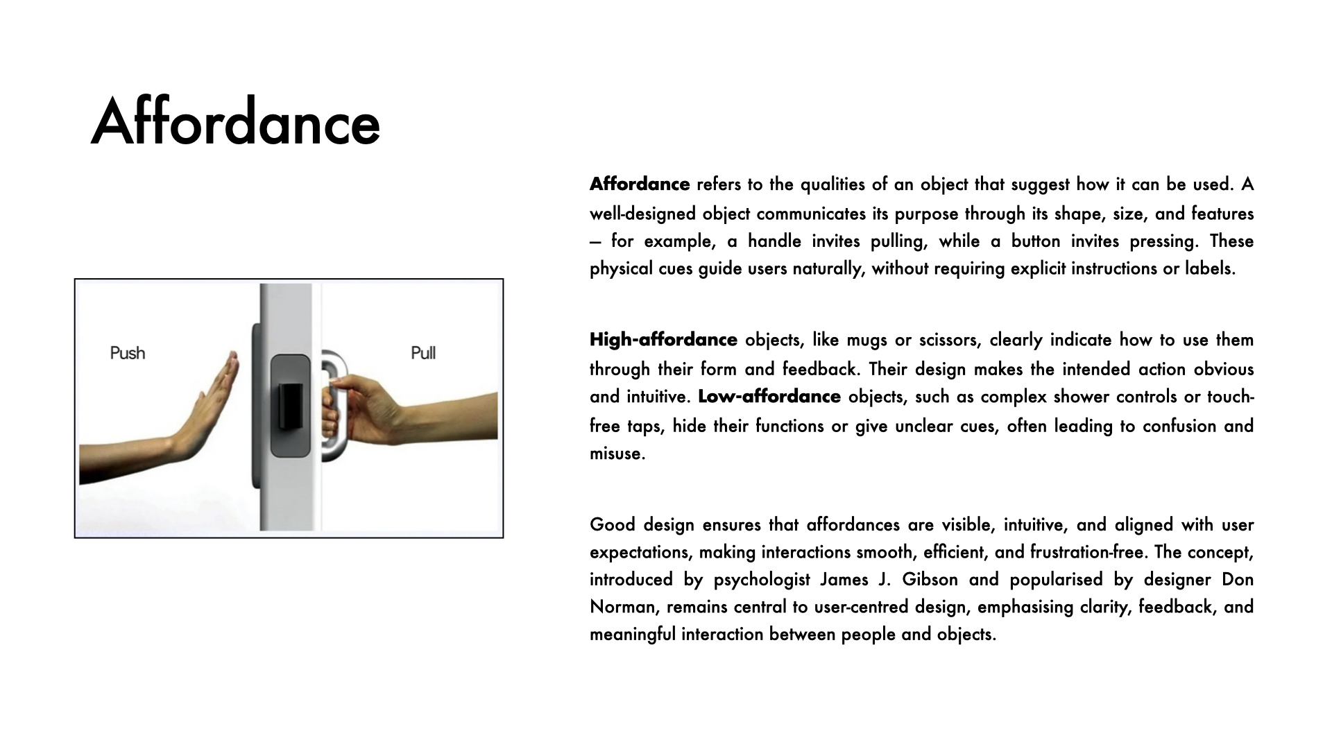
Affordance is a design term that describes the qualities of an object that suggest how it should be used. A really good design tells you what to do just by the way it looks or feels, no instructions needed.
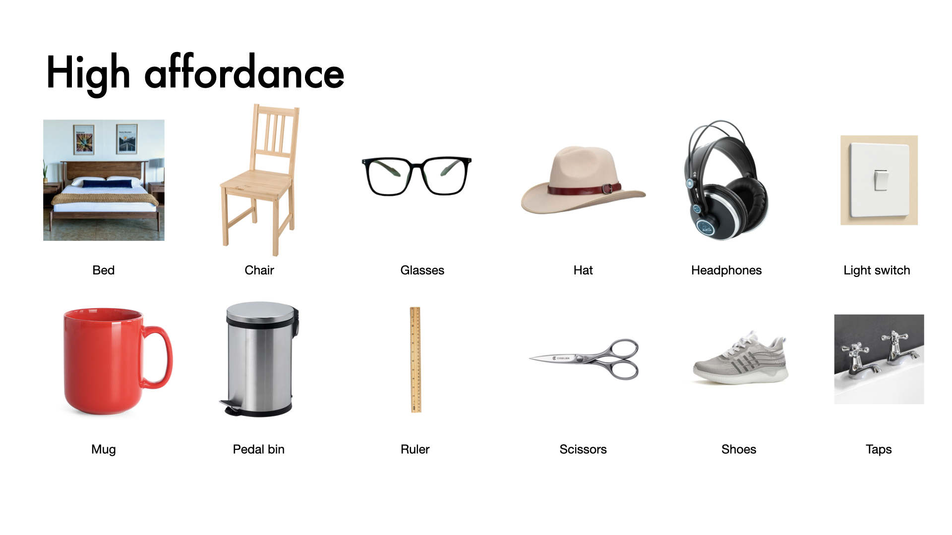
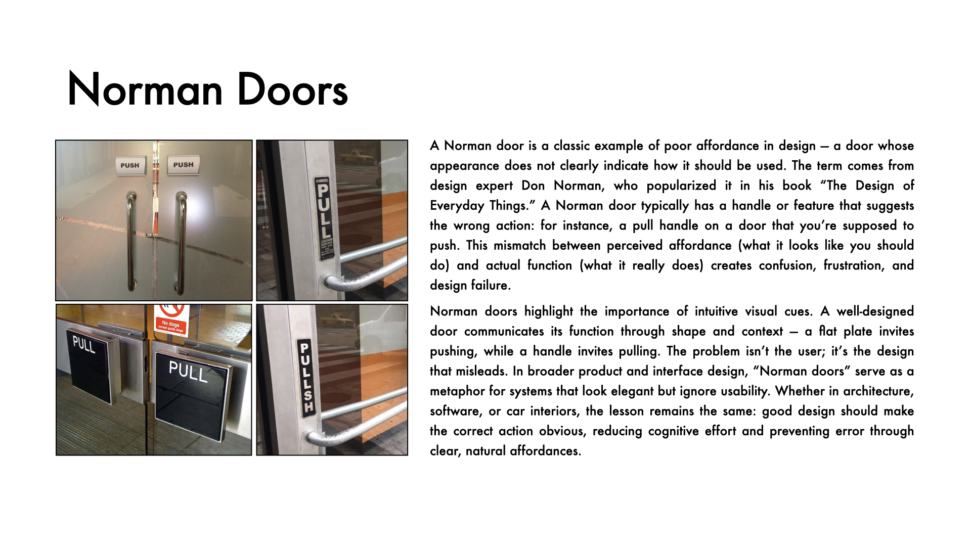
We see affordance everywhere in daily life. A pair of scissors practically explains itself: the loops invite your fingers, the blades invite cutting. But when affordance fails, frustration follows. The classic example is the Norman Door, named after designer Don Norman, because he was the first to identify and write about the problem. These are doors you pull when you should push, or push when you should pull. Their shape sends the wrong signal, so the user feels clumsy, even though it is really bad design at work.
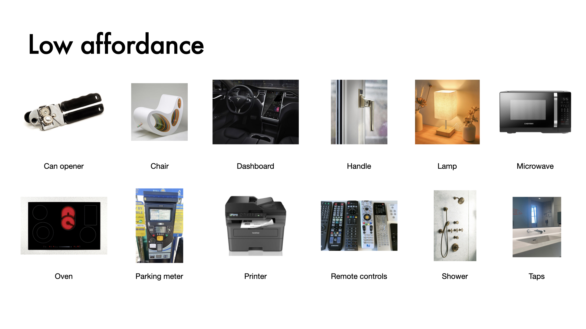
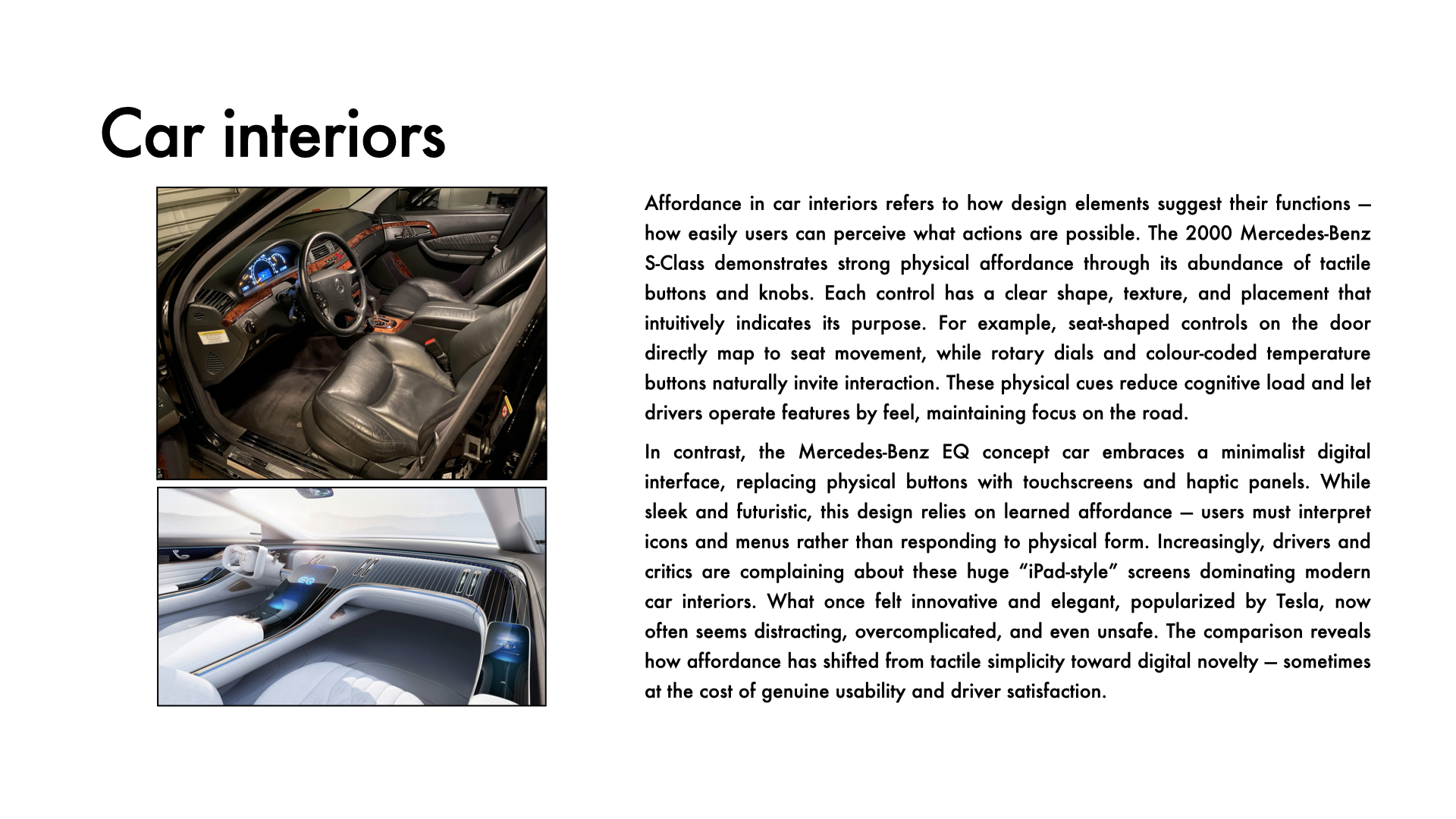
Many car manufacturers have replaced tactile knobs and levers with smooth touchscreens that all look and feel the same. There is no affordance anymore, just frustration disguised as minimalism. China has become the first country to ban hidden door handles on electric vehicles, a design popularised by Tesla. Sleek and flush with the car's body, they look striking but leave users fumbling in an emergency. When style overrides affordance, safety pays the price.
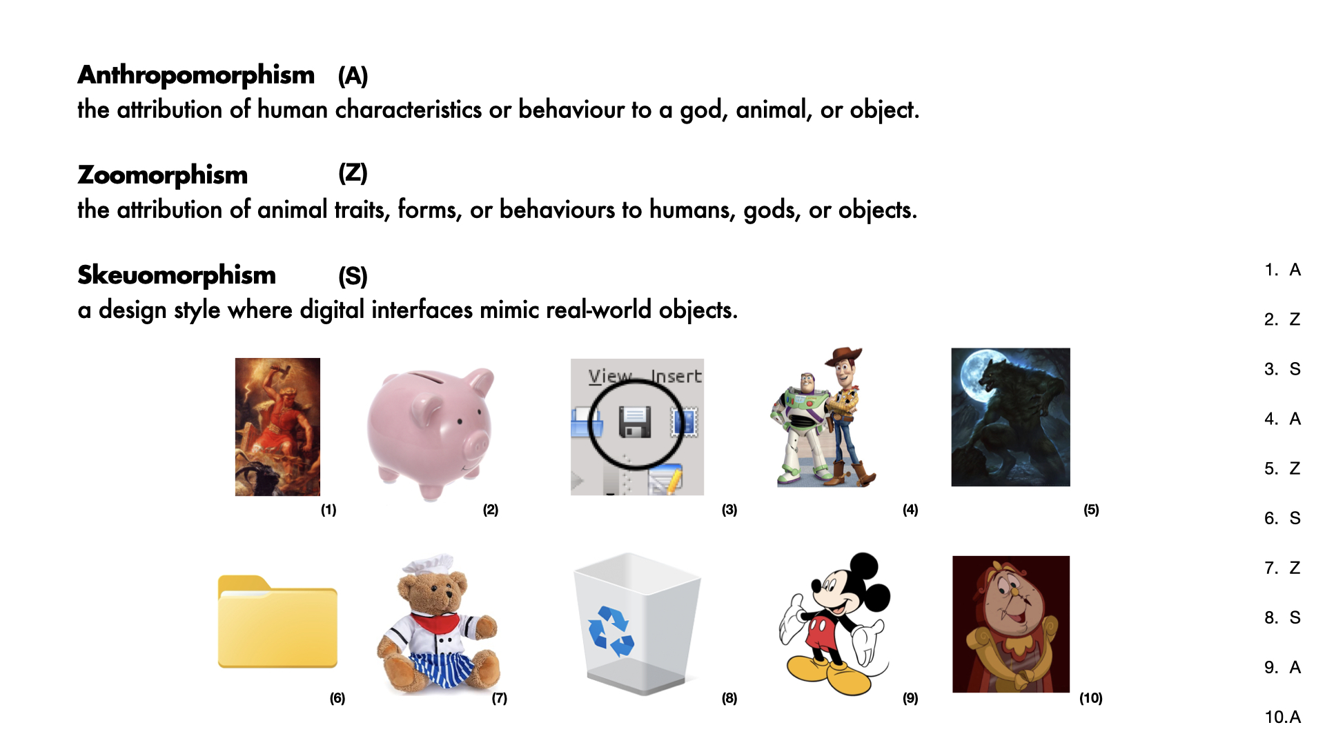
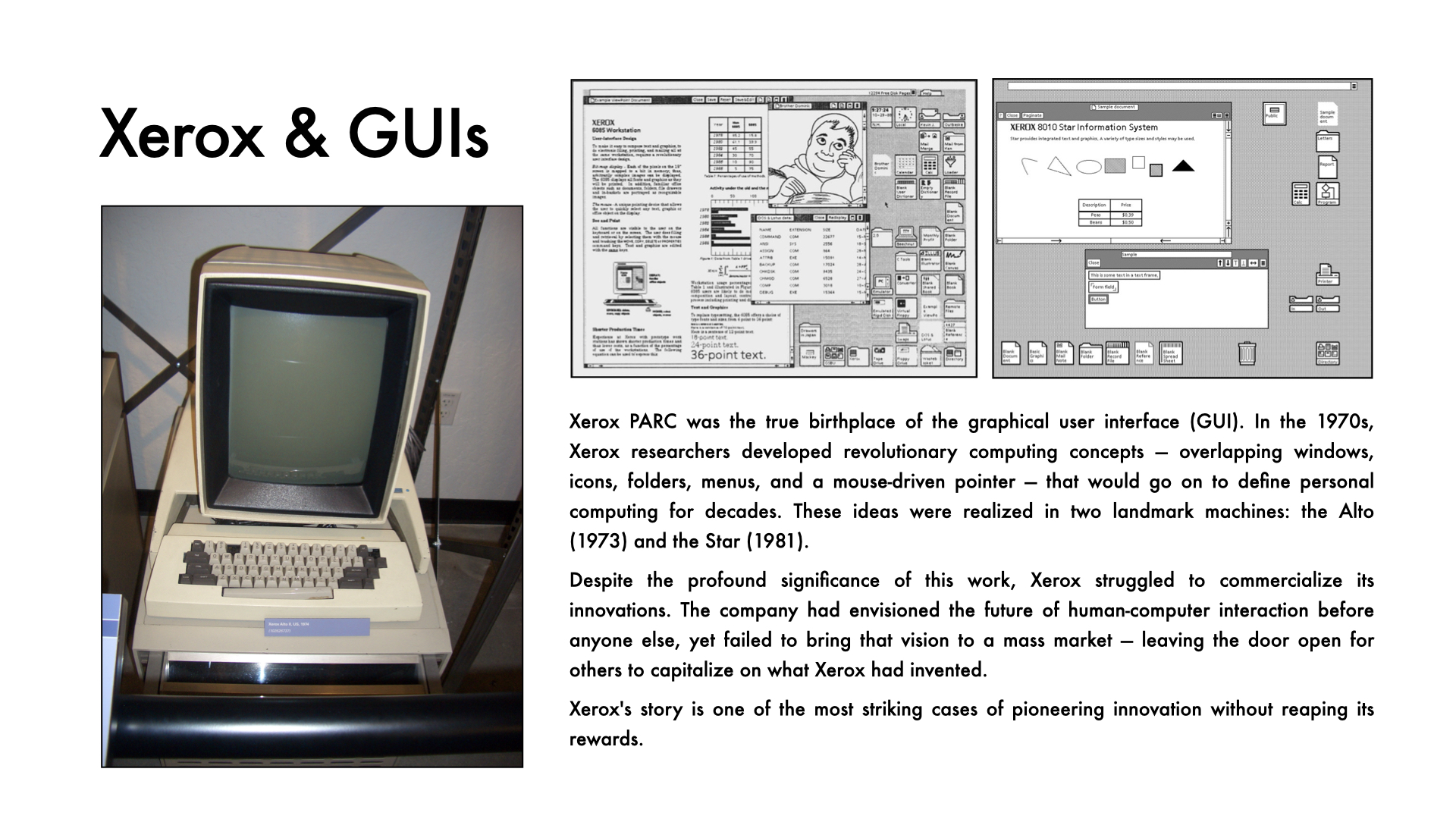
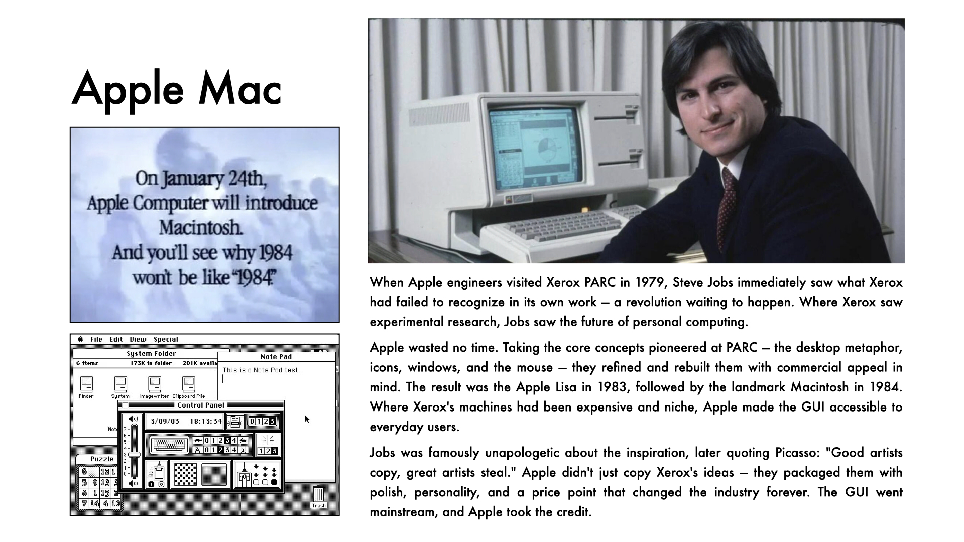
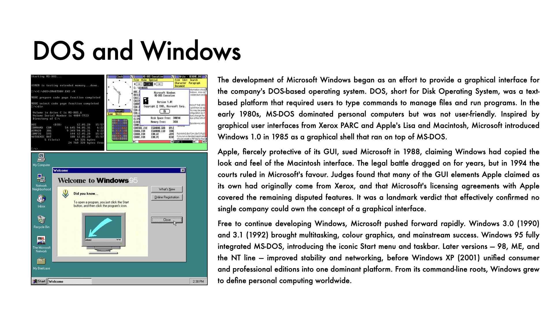
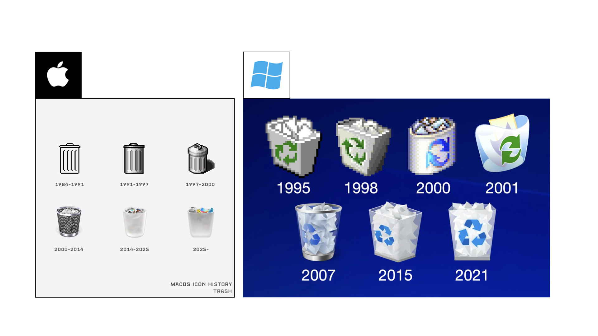
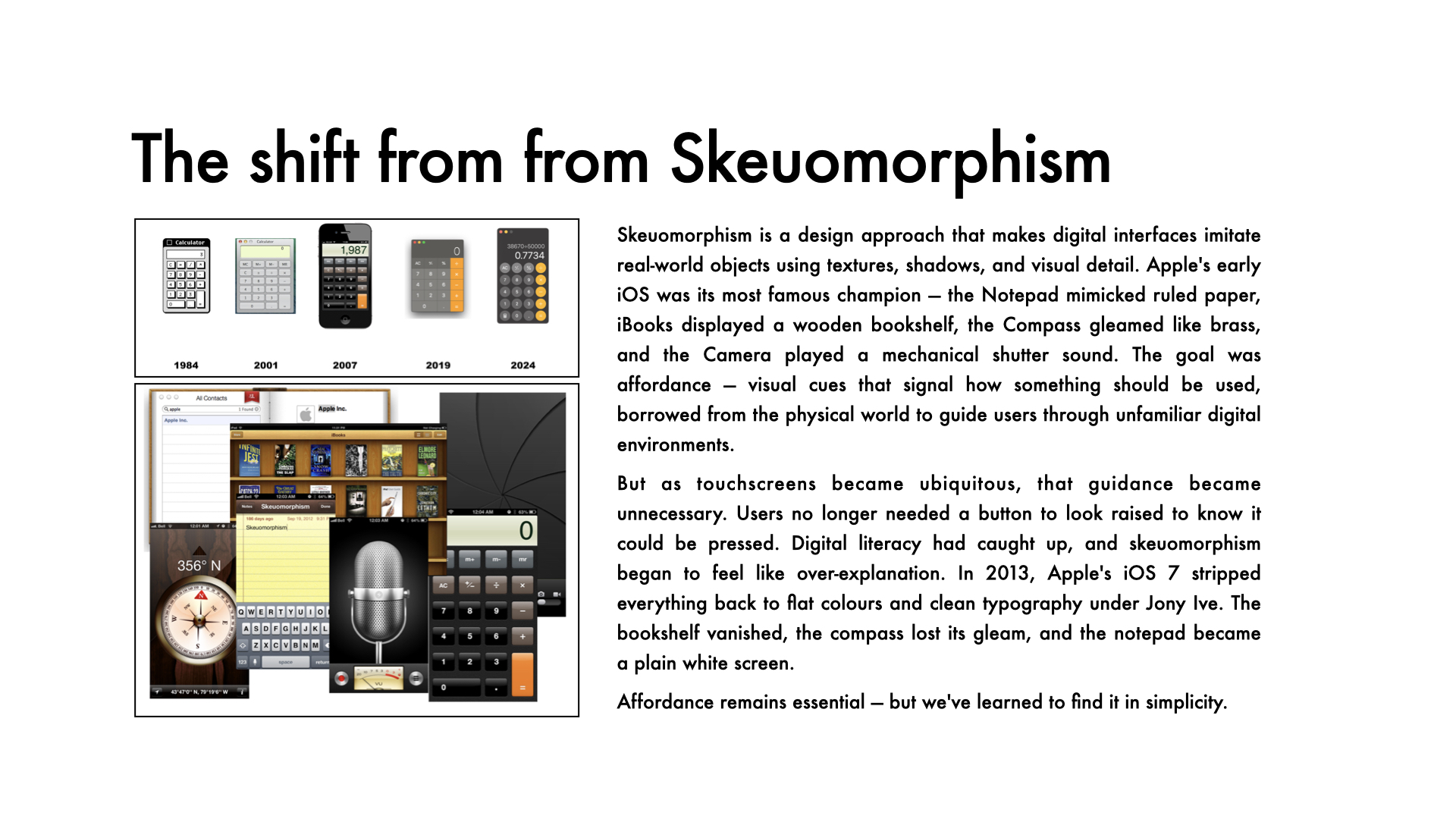
Affordance also shaped how we interact with technology. At Xerox PARC in the 1970s, researchers invented the graphical user interface and with it a powerful idea: skeuomorphism, making digital objects look like their real-world counterparts. The desktop, the folder, the trash can were all borrowed from the physical office so that computers felt immediately familiar. Even the name Windows, Microsoft's operating system, is skeuomorphic: named after a real world object, recreated digitally as a way to manage software on screen. The floppy disk save icon is perhaps the most classic example of all. Most younger users today have never held one, yet the symbol still universally means save.
When Apple launched the iPhone, digital buttons looked raised and pressable, notepads had ruled lines, bookshelves had wooden shelves. Touch felt natural because the visuals promised it would work. That is affordance at its most powerful: design that earns your trust before you have even used it. However, recent design trends have moved away from this idea, perhaps showing many of us are now fully fluent in mobile interactions.
📽️ Slideshow
📺 Video
🔑 Key Vocabulary
- Accessibility – how easily a design can be used by people of all abilities.
- Affordance – visual or physical clues that suggest how an object should be used.
- Ambiguity – when a design’s purpose or function is unclear.
- Clarity – the quality of being easy to see, understand, or interpret.
- Cognitive overload – when too much information overwhelms the user.
- Consistency – keeping similar controls and layouts across systems.
- Constraint – a feature that limits how something can be used to prevent error.
- Discoverability – how easily users can find available functions.
- Ergonomics – designing for human comfort and efficiency.
- Feedback – a system’s response showing that an action has worked.
- Hidden controls – essential features not visible or obvious to the user.
- Intuitive design – design that feels natural and requires no explanation.
- Learnability – how quickly users can understand and remember how to use something.
- Low affordance – when a design doesn’t clearly indicate how it should be used.
- Mapping – the relationship between controls and their real-world effects.
- Mental model – a user’s internal understanding of how something works.
- Perceived affordance – what users think they can do based on appearance.
- Simplicity – reducing unnecessary complexity in design.
- Signifier – a cue or symbol that indicates possible actions.
- Usability – how effectively and efficiently users can achieve their goals.
💬 Conversation Questions
- Which everyday object do you think has the worst affordance, and why?
- Have you ever struggled to use a device because its design was unclear?
- What’s an example of a product you find very intuitive to use?
- How do clear signifiers improve a user’s experience with a product?
- Why do you think public machines like parking meters often cause cognitive overload?
- Can you think of a design that relies too heavily on hidden controls?
- How do your mental models affect the way you approach unfamiliar technology?
- What’s an example of a design that gives excellent feedback to the user?
- How important is consistency in the usability of everyday objects?
- Which redesign of a common object do you think would improve simplicity or clarity the most?
🌐 Links
- 99percentinvisible podcast – Stick it to 'em
- Time magazine – Why the Computer Mouse’s Inventor Isn’t the Big Cheese
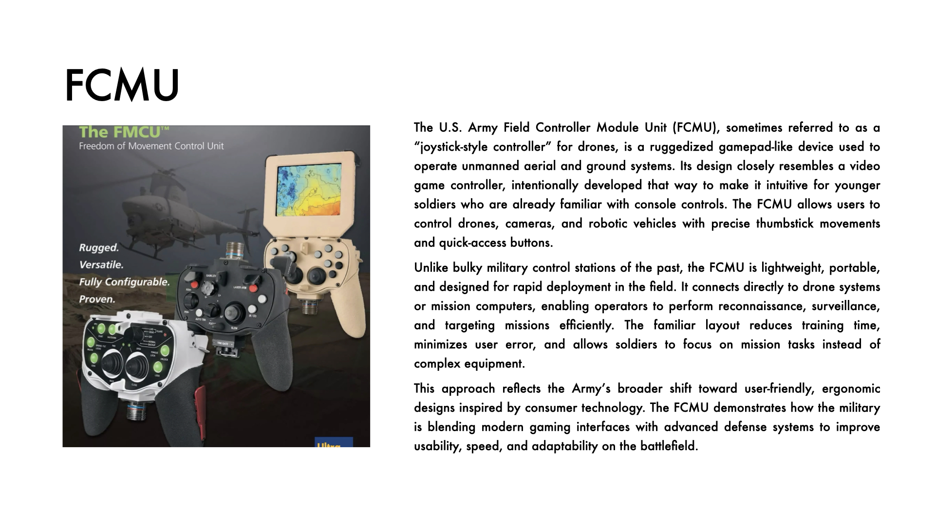
- WIRED.com – This Video Game Controller Has Become the US Military’s Weapon of Choice
- WIRED.com – Touch Controls on Stoves Suck. Knobs Are Way Better
- Apple Insider.com – What Apple learned from skeuomorphism and why it still matters